We are excited to announce that MakoDigital Arts CIC will soon be transformed into Digital Arts Box CIC.
Why is this happening?
We feel the time is right to embark on this new direction for our Community Interest Company so that it stands alone from Mako Create, both in its branding and mission.
It is important to us that our CIC strives to deliver outstanding digital arts projects through the efforts of its dedicated and growing team, whilst ensuring it remains a social enterprise which exists solely to do good in the community.
Our mission is to provide fascinating experiences which inspire communities to embrace creativity and express themselves, our new-look CIC – Digital Arts Box, will be integral to that effort now and in the future.
What does this mean moving forward?
You can expect a gradual change in terms of our branding and a whole new website in the near future, but in terms of our work, we’ll continue to deliver the same great, innovative and creative experiences in the local community.
The new “Digital Arts Box” logo
Let’s take a look behind the scenes at what our process of rebranding has looked like:

Step 1 – Wording
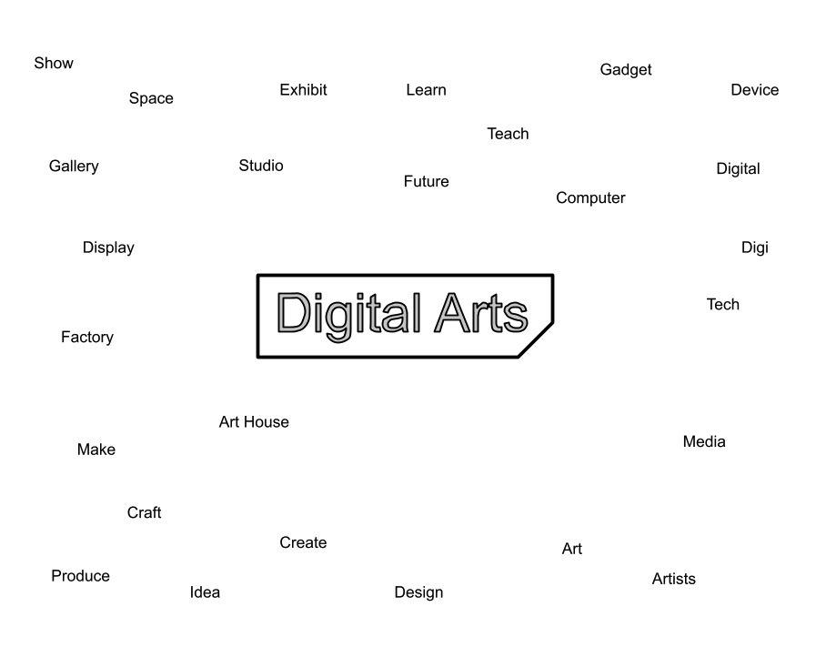
We started off by thinking about a new name for our organisation. It was critical to take ‘Mako’ out of the new name so that our CIC stood alone from Mako Create. ‘Digital Arts’ is an important concept for us, so we broke down what it means to us and to our collaborators and workshop participants:

Step 2 – Visuals
We then turned to our new logo and iconography, which is an important entry point for any brand.
We put our heads together to think about what we wanted the logo to encompass, writing down words that best summed up the company.
We explored the idea of incorporating each letter of our new name, so we based early logo concepts around the letters DAB –
Did you know: the fancy name for this type of logo is a “Lettermark”
At this point, we weren’t too concerned with the colourway or font but we wanted to focus on the icon itself, by trying to incorporate a “box” into the design.
Step 3 – Font
Once we had a feel for the icon that we liked, we thought about the font we wanted to use.
We played around with the idea of the font reflecting the logo design, but decided it was a bit aesthetically harsh (fussy), with too many angles, so chose a more traditional and easy to read font style.
At this stage of the design process, it can feel overly critical to analyse the most miniscule of details, but the choice of font is integral to setting a tone and conveying the personality of an organisation:
Step 4 – Versatility
Finally, we tried out our new designs in a range of backgrounds and contexts to ensure our brand messaging told the story we wanted to tell about Digital Arts Box.
We wanted to make sure it was bold and stood out, working across a variety of backgrounds and art disciplines. The idea being that ultimately, the art that the CIC is producing is more important than the logo, so our logo needs to be versatile and able to transcend all digital creative art disciplines.


Watch this space for more news about the big changes we are making to this organisation, we’d love to hear your thoughts on our new branding and more importantly about what you would like to see Digital Arts Box CIC bring to our local community in 2021 and beyond
Would like to help support us?
If you would like to support us to continue to deliver creative projects and activities please use the button below to make a donation.